Disco Day | These Days collection | Sue Plumb
Hi everyone, Sue Plumb here to share my latest design team project with you.
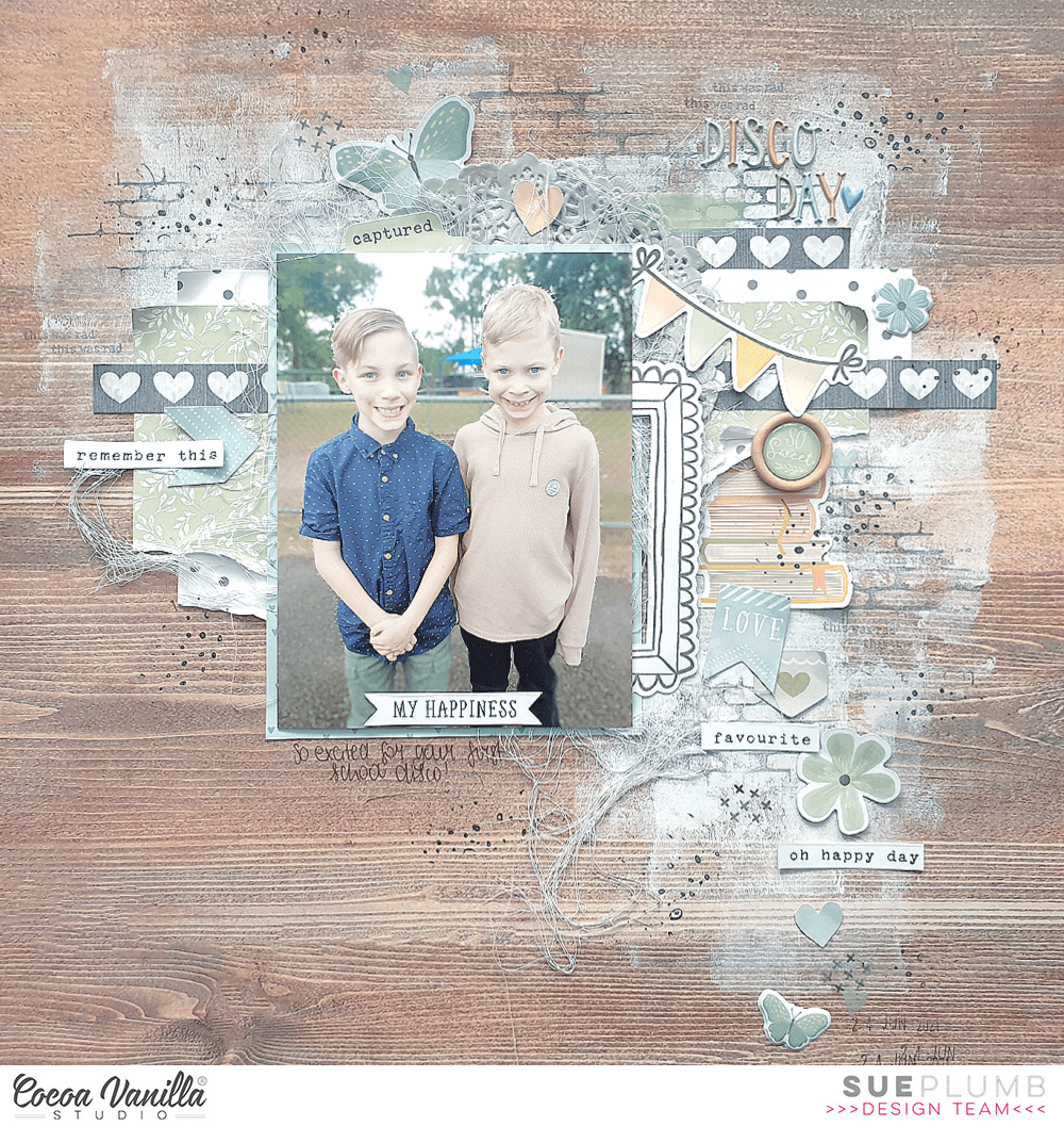
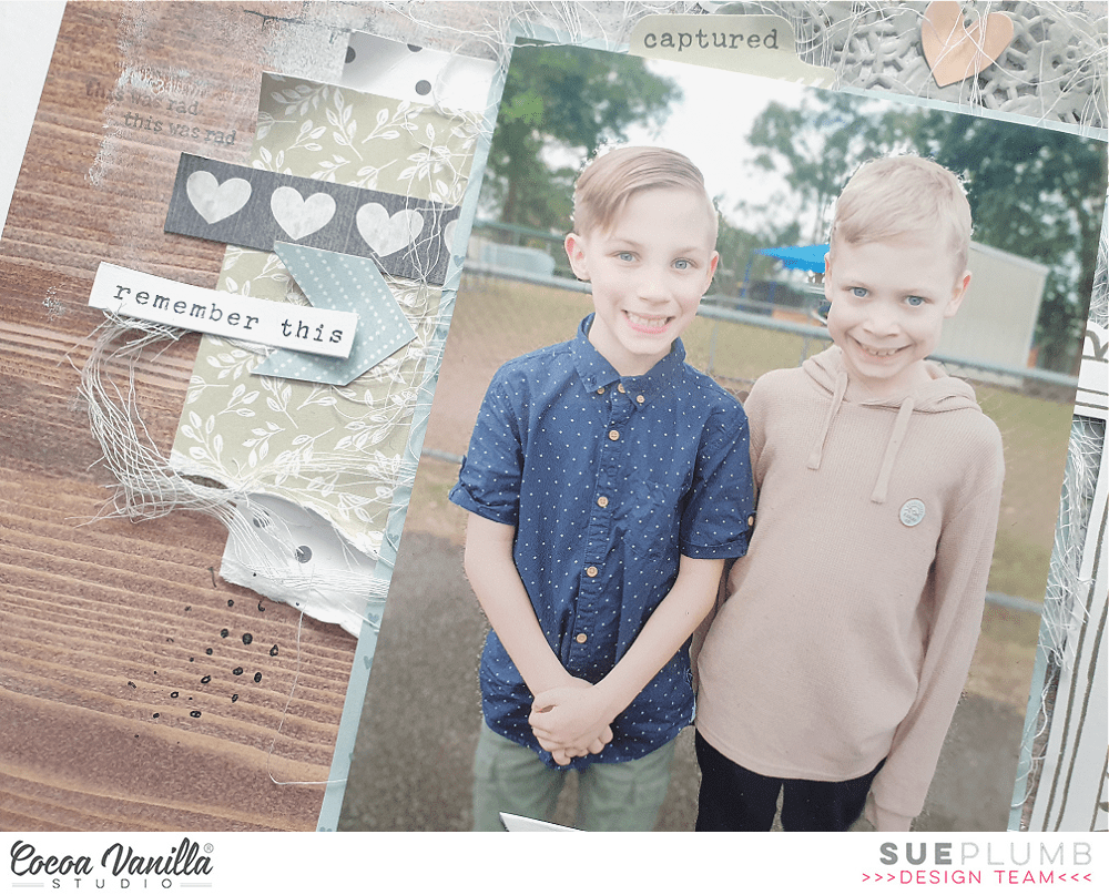
For this one I decided to pull out my supplies of the beautiful ‘These Days’ collection as I still have plenty in my stash left to play with and was dying to use it again. I also had a sweet photo of my boys together that I took last year when they were heading off to their first school disco. Although they might be twins, you can see that they are very different and both have their own individual styles, which I thought was summed up quite well in this shot.

Despite the fact this range has quite a broad palette of soft colours, I decided to focus on predominantly the blue and green tones combined with the wood grain for my background. Before I moved onto my papery layers however, I really wanted to add some depth to the background by adding some paint and stamping. I used a white paint applied with a brayer, which also helped me to define the focal area of my page. Over the top of the paint, I used a brick pattern stamp with a grey ink.
For the papery layers over my background, I used a few papers from the A5 Paper Stack which I cut and tore to size. I also added a grey paper doily from my stash, a strip from the cut apart paper, and some frayed gauze for texture. My photo also had some scrap cardboard adhered to the back of it to help pop it up from the page.
For my embellishments, I started with the Die Cut Ephemera pack. I chose a doodled frame first, which I cut in half and tucked half in under the right edge of my photo. I often use frames in this way (cut into pieces and tucked into layers) as opposed to the way they were designed to be used. I also chose the stack of books from the ephemera pack as I thought this worked well with the fact it was a school disco the boys attended.
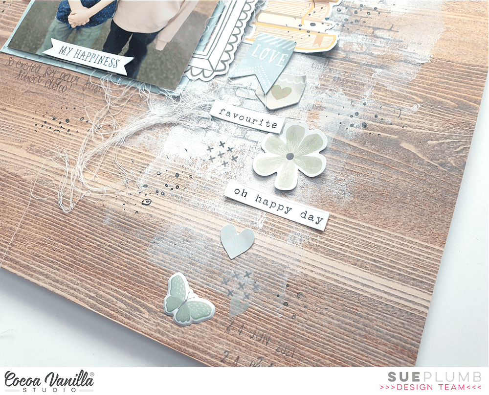
I used the gorgeous Mini Puffy Alpha stickers for my title, as I didn’t want to detract from all the delicate elements I had on the page. I love these alphas sooo much, they are a perfect size and such a pretty mix of colours. Along with the puffy alphas, I also added some of the Puffy Stickers to my page – a heart, a flower and a butterfly (because you can never have too many butterflies!)
There were plenty of regular Accessory Stickers on this page too – you can see how I used the tab and flag amongst the cascade of embellishments alongside my photo, and there were several phrase stickers used as well. From the Clear Stickers sheet I used three small clusters of crosses and a green brush stroke. This coordinated beautifully with the green Epoxy Wood Button that I also included.
I finished off my layout with handwritten journalling; stamped phrases and date; and some black stamped doodled circles and dots.
I have a process video available for this layout. If you would like to see how it came together you can watch it here:
Thanks so much for stopping by today, I hope you are feeling inspired to get creative too. Until next time, happy scrapping!


