BLOOM | THESE DAYS | GWEN WRUCK
Hi Creative Friends,
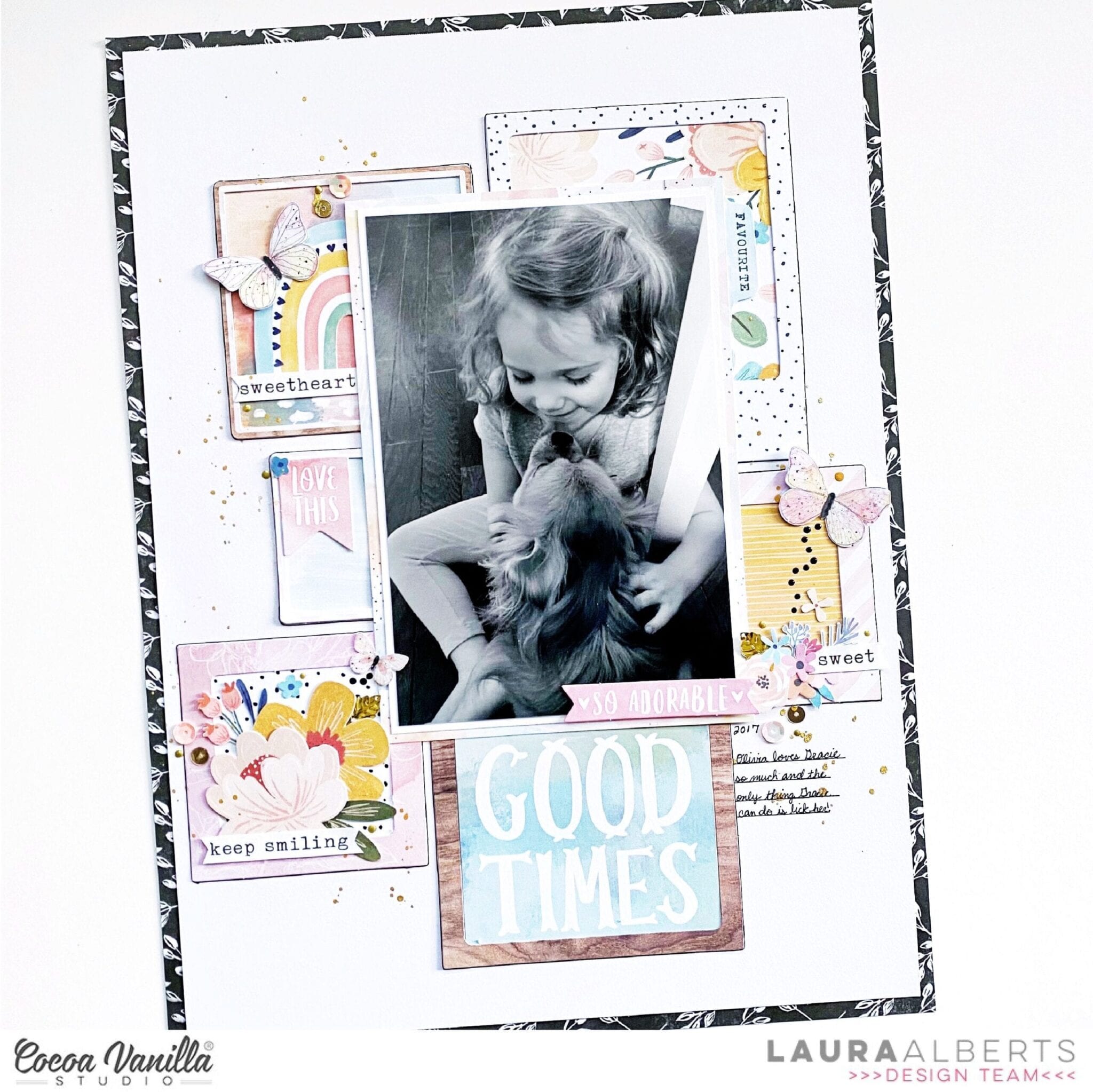
Gwen with you on the blog today sharing a new layout using the ‘These Days’ collection. We are doing a bit of a Scrap-lift on the blog this week and I’m super excited to be inspired by a layout created by Laura Alberts. I’ve included an image below of her layout so you can see all the inspiration I’ve had for my page.

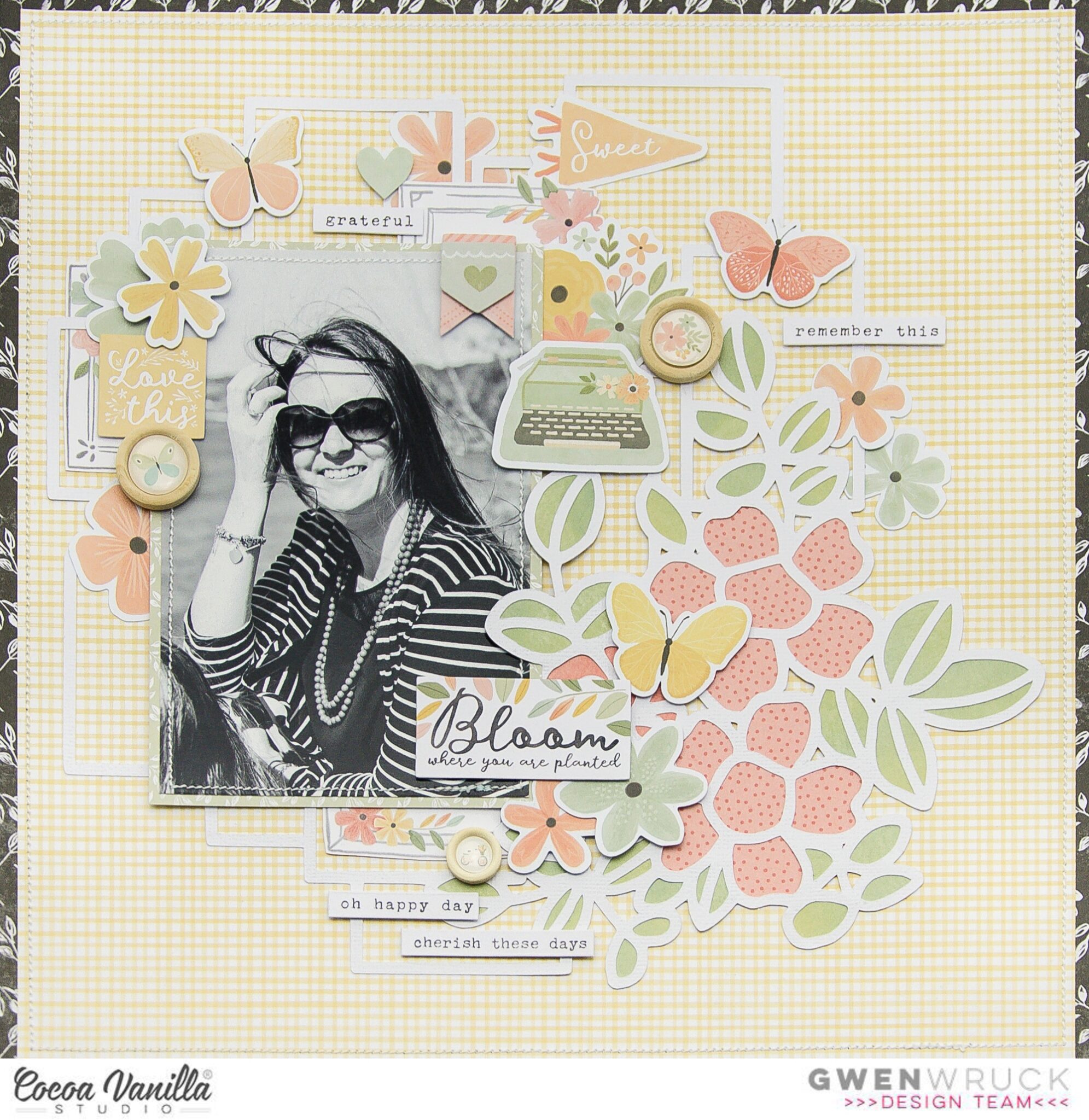
There is so much about Laura’s page that inspires me. I was first drawn to the frames in her background and their grid like format. Then I was drawn to her black and white portrait image finished off with a striking black border on her layout. For my layout, I simply started with those three elements and went from there. I’ve pulled from my stash the same black and white pattern paper she has used for her outside edge (More than Words Collection – Gossamer) and then teamed it with the latest ‘These Days’ collection. I’ve also found a black and white portrait photo to use, just as she has. This one is a photo of me and I thought, why not use it, I don’t scrapbook myself nearly enough :) I know I’m also going to use some butterfly embellishments just as she has in her page.
For the background of the layout, I’m using the ‘Home Grown’ pattern paper. I love using pattern paper rather than card stock for my page backgrounds, this one is a pretty shade of yellow. I’ve then pulled out a cut file from CUT to YOU, this one is a lovely mix of floral and frames. I wanted to replicate the frames on Laura’s layout here. I have gone ahead and backed the cut file using the A5 paper pad and then left the frames all open so that my lovely yellow background will show through.
Next, I’ve backed my photo and then fussy cut out a few of the pretty frames from the ‘Wall of Frame’ pattern paper. I’m going to use these to layer into the frames in my cut file for something different. This is a great way to give a bit of a backed look to the cut file, without the hard work. The frames in this pattern paper are super quick to fussy cut out. I’m using both of these elements taking inspiration from the frames in the background of Laura’s page.
I have positioned my photo to the left of the page so that you can see most of the floral elements in my cut file on the right. From there, I’ve created three embellishment clusters using lots of elements from the collection.
I’ve featured elements from the ‘Die Cut Ephemera pack’ as well as florals from the ‘Floral Ephemera’ pack. For the title of my page, I’m going with a sticker that says ‘Bloom where you are planted’ from the ‘Accessory Sticker Sheet’. I’ve also used the typed sentiment stickers on the bottom of that sheet adding them to my page with foam tape for dimension.
To finish up the page, I’ve added in 3 of the ‘Wooden Buttons’ and they really help draw the eye around the layout as well as adding some lovely texture to the page.
I’ve also made a YouTube process video which you can watch here:
Thanks for popping by today, I hope you enjoyed seeing the details in my layout and that it has inspired you in some way :)
Until next time,
Gwen
xo


