Adventure | Great Escape collection | Sue Plumb
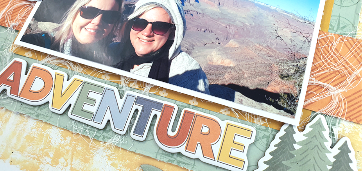
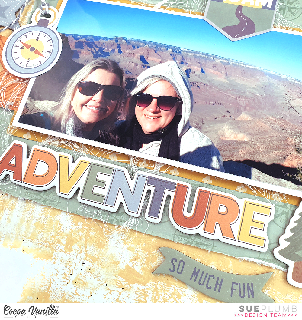
Hi everyone, it’s Sue Plumb here to share my latest design team project with you. Today I am sharing another layout using the fabulous ‘Great Escape’ collection that documents a photo of Zoe and I on our trip to the USA back in 2019. This pic was taken the day we went to the Grand Canyon, and it definitely rates as one of my favourite days EVER – I am so happy we got to share it together.
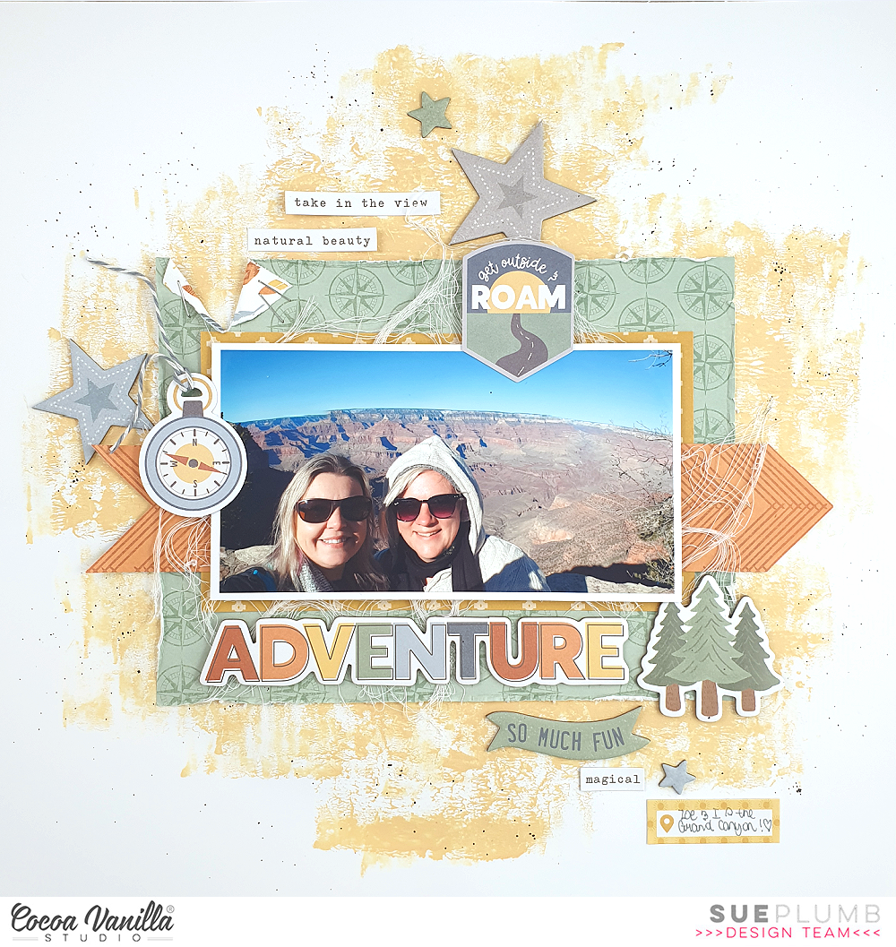
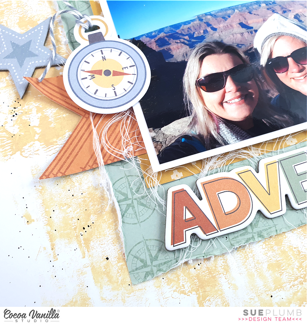
I started this page with a sheet of white cardstock and added some ‘Naples Yellow’ acrylic paint to it using a brayer. I chose this colour because of it was a lovely earthy yellow, and I knew it would work well with the other colours of the collection. I then chose a selection of patterned papers for my papery layers, including the green compass print from the Direction paper; the mustard yellow crosses from the A5 Paper Stack; and the orange chevron pattern from the Happy Camper paper. I distressed the edges of the green one to add some texture, before layering the other two on top.
Once the papers were in place I then added some frayed gauze before placing my photo on top of the layers. You can see how I cut the orange chevron print into an arrow shape to run behind my photo from left to right, which helps draw the viewer’s eye in and across the panoramic photo.
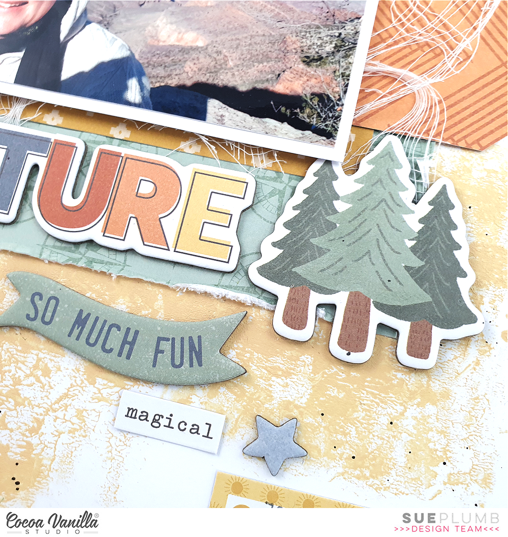
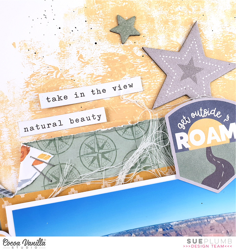
For my embellishments, I started by adding three main pieces around my photo – the compass on the left edge from the Die Cut Ephemera pack; the get outside and roam badge (also from the same pack) at the top; and the group of trees from the Chipboard Sticker sheet in the bottom right corner. These three pieces created my visual triangle around my photo and gave me anchor points to work from for the remainder of my embellishments. The other reason I started with these embellishments is because they were all larger pieces and it is always easier to get the biggest things on a page first.
The next piece I added was the ADVENTURE title from the Chipboard Sticker sheet. I knew I wanted to run this piece along the bottom edge of the photo because it is quite a long title and it mirrored the shape of my photo. With all those large elements in place it was then easy to go back and add a few extra embellishments to finish it off. I used the so much fun banner piece and a few stars from the Chipboard Sticker sheet, along with some tiny words and a label from the Accessory Sticker sheet.
I was determined not to over-embellish this page and detract from the photo, so I finished it off with only a few tiny black ink splatters and my handwritten journalling on the label.
I am loving creating with this collection so much, and I have another project with it in the works at the moment that I can’t wait to share! I’ll be back in two weeks with some more inspiration for you.
Until then, happy scrapping!

