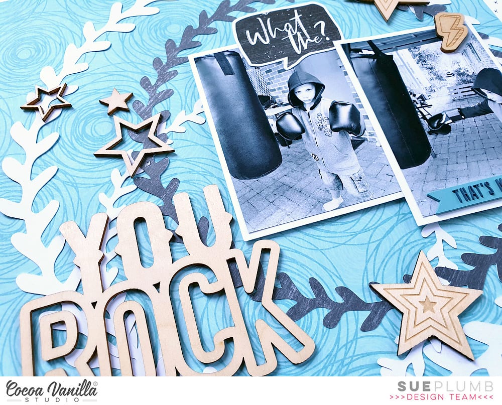
You Rock | Page Maps Sketch | Boys Rule & You Rock Collections | Sue Plumb
Hi everyone!
Sue Plumb here today, and it’s my turn to share my layout for the PageMaps sketch theme that our team have been challenged with this week. It has been amazing to see how all my fellow designers have interpreted the sketch so far, and the range of pages that a single sketch can inspire.
Here is the sketch we have all been working with…
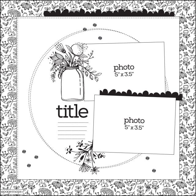
This sketch is one from the PageMaps archives from October 2018; and if you would like more sketch inspiration (including card sketches) you can find them on the PageMaps website.
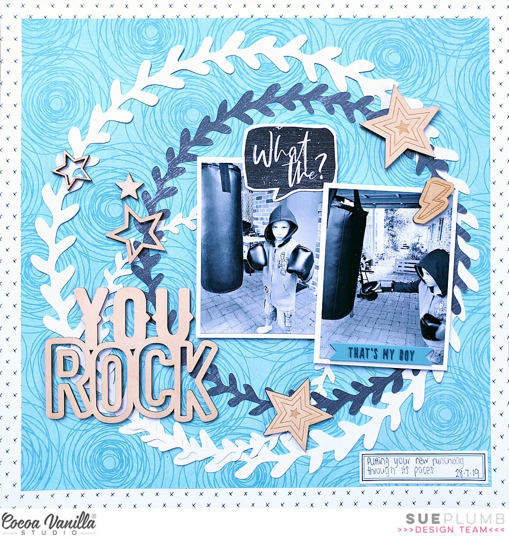
Despite the floral theme of the sketch, I decided to twist it up and create a boy page instead. I used a combination of elements from two different CVS boy collections – ‘Boys Rule’ and ‘You Rock’.
I began with the ‘Boys Rule’ collection – using the Star Fall paper as my page base to form a border, which I layered with a smaller square of the Entitled paper over the top.
To represent the circular element of the sketch, I cut several different sized wreaths from the free ‘Happiness’ cut files using a combination of white cardstock and the Happy Go Lucky paper for my feature circle. I then arranged them so they were overlapping each other.
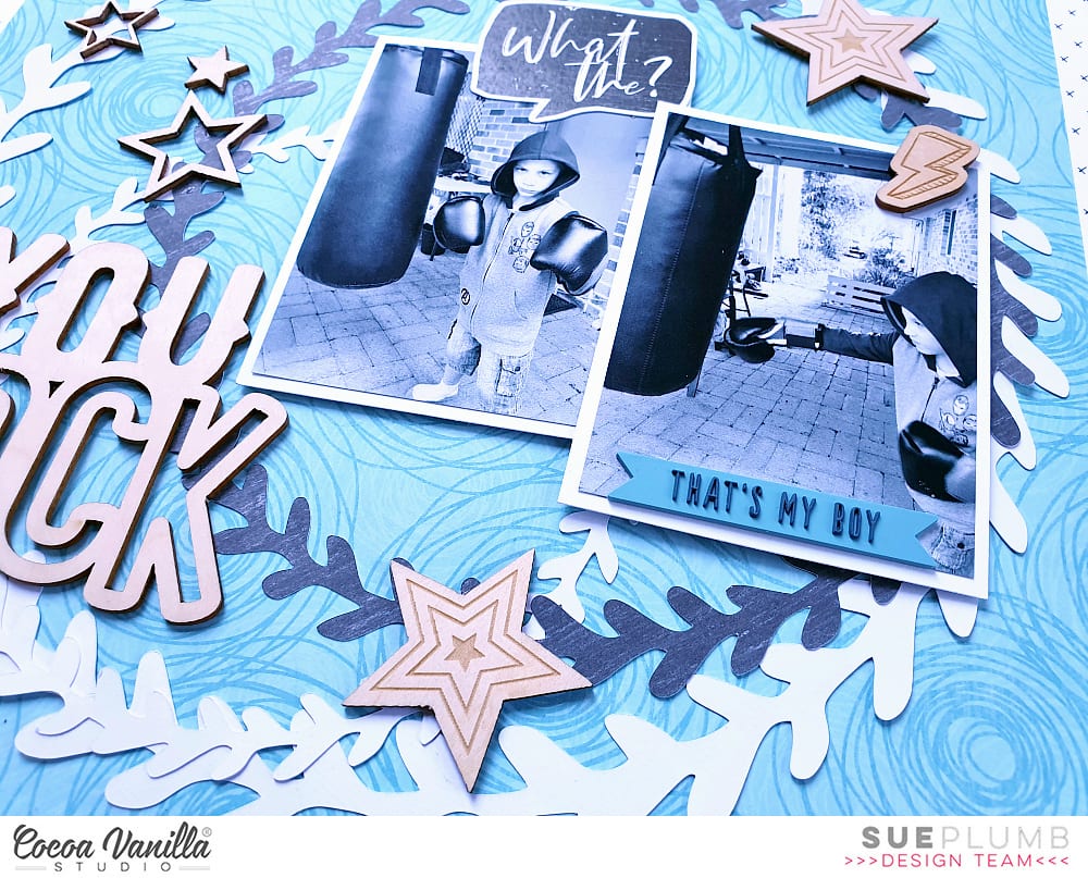
Just like the sketch, I used two photos for my page (although I did use a different size and orientation). These photos of my son were taken the day after his birthday while he was testing out his new punchbag and boxing gloves.
I added the die cut what the? speech bubble from the Die Cut Ephemera pack onto my main photo.
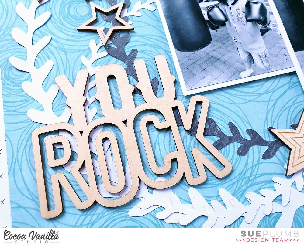
Due to the busy pattern on the paper, and the fact that I already had the overlapping wreaths on my background, I wanted to keep the embellishments fairly simple. I dug through my stash and chose the wood veneer pack from the ‘You Rock’ collection. I liked the fact that this was an easy way to add dimension and some natural texture to the page.
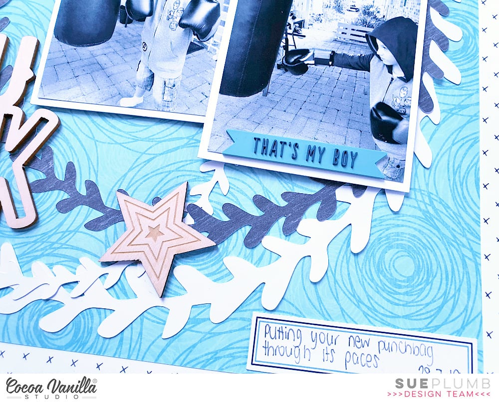
I added the large You Rock title piece just to the left of the photos – just like the title was positioned in the sketch. I then adhered a selection of wood veneer stars around the page, placing them at points where the wreaths intersected and forming a “visual triangle” around my photos. I also added a small wood veneer lightning bolt directly onto my second photo.
To finish off, I added the that’s my boy rubber charm along the bottom edge of my photo; then added a small label from the Miscellany die cut pack to the bottom corner of my page and wrote my journalling with a felt pen.
Thanks for stopping by today, I hope you are enjoying our sketch feature this week. Pop in tomorrow to see another layout from our team inspired by the same PageMaps sketch. Until next time, happy scrapping!

