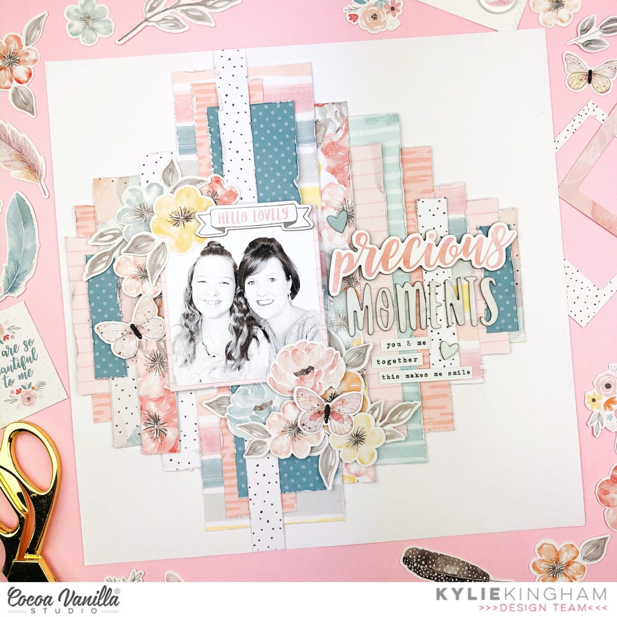
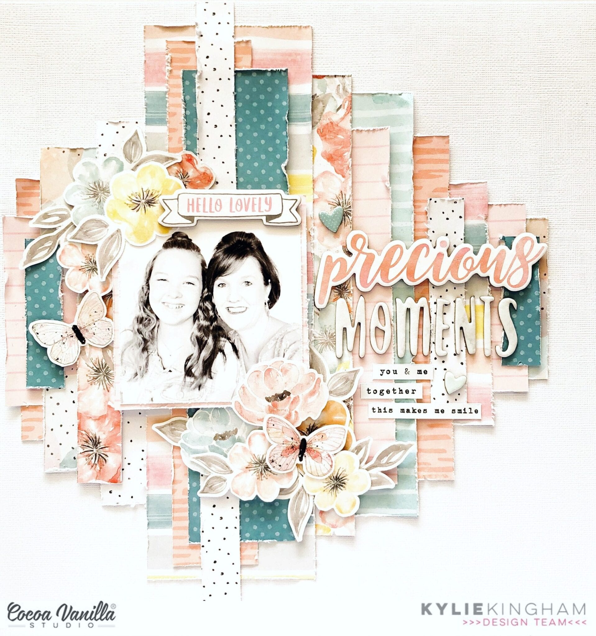
Precious Moments | More Than Words collection | Kylie Kingham.
Hello! It’s Kylie back with you today on the blog, sharing a new layout with one of my favourite past collections, ‘MORE THAN WORDS’. I really only had several bits and pieces left in my stash so I thought it would be good to share my ‘go-to’ layout design for when you wanted to use up all your scraps.

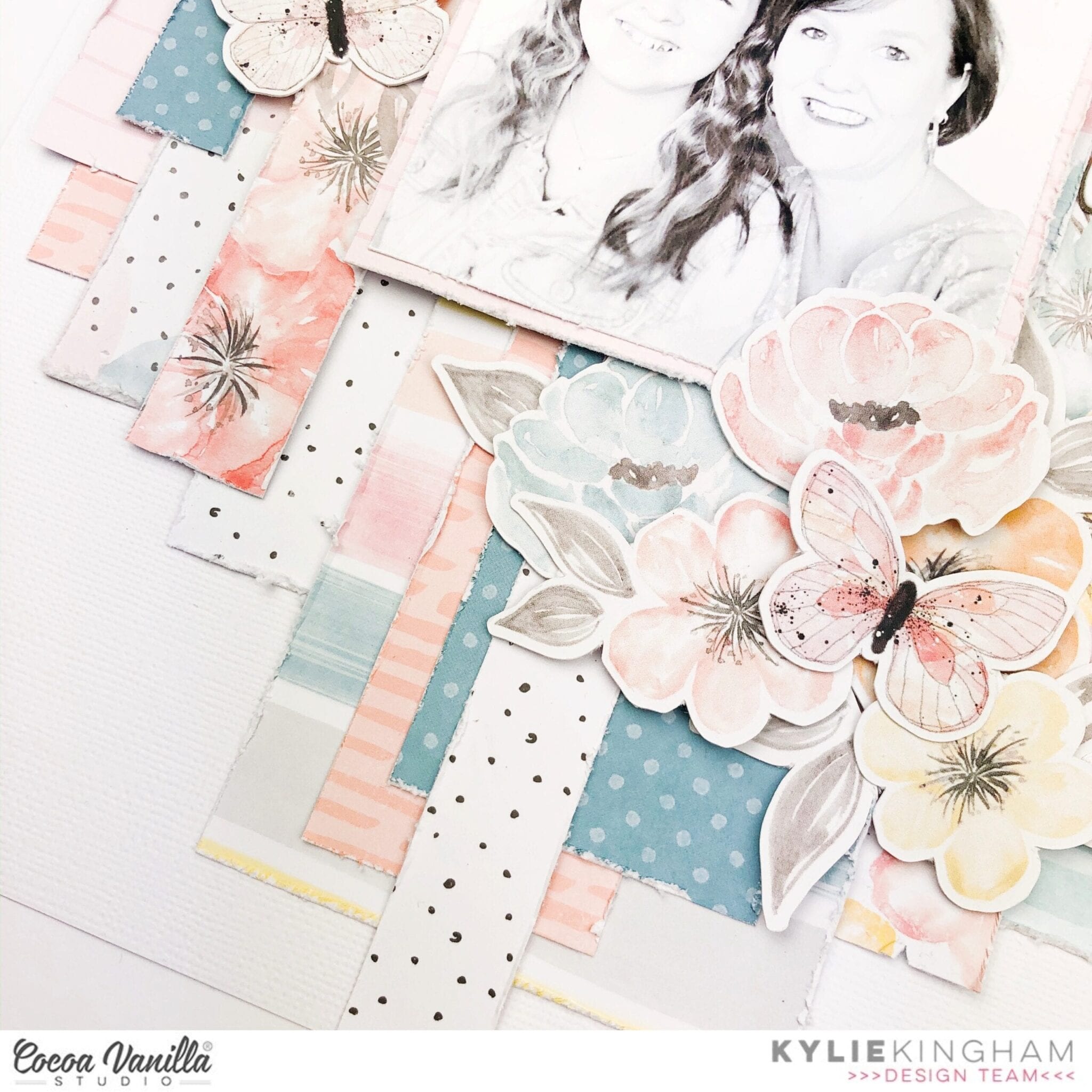
It’s a really easy layout to bring together. I started with a white cardstock background and set about cutting down strips of papers at varying widths and heights. I like to distress the edges of them a little before I start adhering them into place. Each strip is then layered over each other being careful not to have everything too symmetrical. I think the background works so well because no two pieces of paper are the same size. Once I was happy with the positioning of them, my photo was added over the top.For balance I have added some gorgeous die cuts to support my photo with foam tape, so that they sat up from the background, adding dimension.
From the chipboard stickers and the accessory stickers I have created a main title as well as a sub title phrase below.
Once completed I loved all the rustic layers in my layout…
Thanks for taking a look at my latest layout today. I hope it gives you a little inspiration for your own creating.
Kylie.


